How to Analyse Survey Data in Excel [+Video]
Statistical packages are powerful, expensive and overkill for most customer feedback work. Excel can do almost everything they can do, and it's already on your desktop. Here's a step-by-step walk-through of analysing survey data in Excel — simple stats, error bars, histograms — with a video to follow along to.
![How to Analyse Survey Data in Excel [+Video]](/_astro/how-to-analyze-surveys-in-exce-opt-e1607575803448.ZxA-rJo-.jpg)
On this page
While there are many advanced statistical packages, you don’t need them to perform a detailed and comprehensive analysis of your survey data. You can use the same techniques and approaches using the standard Excel package
In this post, I’ll take you through how to analyse your survey data using the built in features of Excel.
Excel is a very good tool to use for your analysis and has the benefit of being on almost everyone’s desktop. With a little bit of insight, you can do almost everything the statistical packages can do in Excel.
The Three Key Survey Analysis Goals
When analysing survey data there are surprisingly few different types of questions you need to answer.
You will generally only want to know three types of things about your data:
- Are responses different for different questions or segments?
- Are the responses for this question significantly different from the responses for that question?
- Are the responses for this customer segment significantly different from the responses for that customer segment?
- Are responses changing over time?
- Are the responses for one question changing over time?
- Are you getting better or worse in any way?
- Are responses for different questions correlated?
- Are the responses for one question are correlated (potentially implies causes / is caused by) another question?
- If you improve one part of your business will it also lift another part of your business?
This is good news because there are only a few types of statistical approaches you will need and Excel supports all of them.
Important Survey Data Types
There are three different types of data a typical customer survey generates:
1. Numbers: Also Called Ordinal data
Numbers come from questions like this:

A example survey question that creates ordinal data
Technically, the data created by this type of question is Categorical (see below) data. However, we can in general, treat it as Ordinal data.
The critical difference is that with Ordinal data the separation between each number step must be the same, i.e. 1 to 2, 2 to 3 etc. Customer feedback is perception information and it is unlikely that the difference between a 1 and 2 is the same as say a 6 and 7 in the above question, but in practice we can treat it as if it is.
2. Categorical: Category Data
Categorical data comes from questions like this:

A example survey question that creates Categorical data
3. Text: Words
Text data comes from questions like this:

A example survey question that creates Text data
Practically speaking this is the most difficult type of data to analyse. While there are various specialist text analysis engines (Amazon, Microsoft) the only thing you can really do with Excel is searching for content.
We’re not going to attempt to do this in our Excel based survey data analysis plan.
Step 1: Calculate simple statistics (mean, max, etc.) for all questions
Generating simple statistics for your survey data, (mean, maximum and minimum) is easy in Excel.
In the image below we have included the common maximum, minimum and average along with a couple of additional statistics: Standard Error and 1.96 x Standard Error.
Standard Error is useful in understanding how much potential error there is in sample statistics.
We’ll use these statistics in the next section when we graph the scores add confidence intervals for the average.
Excel has formulas for each of these and is smart enough that you can simply highlight an entire data column and it will calculate the statistics for you.
You can download this spreadsheet here: Analysing Survey Data in Excel Template
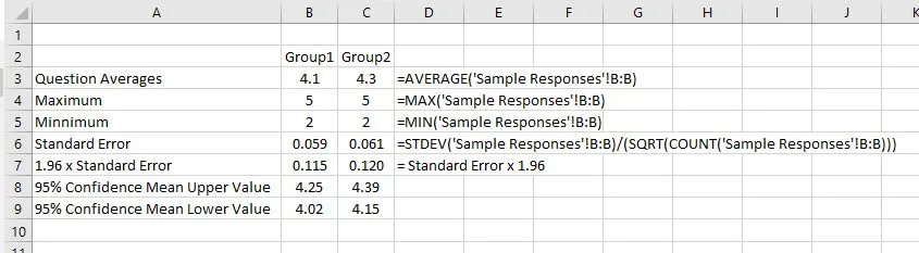
Excel formulas for Average, Max, Min, Standard Error and Confidence Intervals
Step 2: Graph Each Question and Add Error Bars
When you present your data you will almost certainly use charts. So, the next step is to graph the average of each question.
However, one of the problems with most feedback charts is they show only the average. This can be misleading because the response average is only an estimate of the population average.
With a couple of simple steps, you can add Error Bars to your charts to show the 95% confidence interval – which is much more informative.
To interpret the error bars you need to know a little about Standard Error:
The standard error of the sample mean is an estimate of how far the sample mean is likely to be from the population mean.
When we multiply it by 1.96 we are creating a 95% confidence interval.
In other words we are 95% confident that the actual average for all customers is between the upper error bar and the lower error bar.
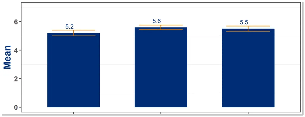
This chart has error bars and is much more informative than one without error bars
Here is a quick video on exactly how to do that.
Step 3: Add Histograms of Each Question
Before you go on to more advanced statistics you should also create histograms of the survey responses to better understand the data.
What are Histograms?
Histograms show you the proportion of different responses to a question and can be used on Number and Categorical data.
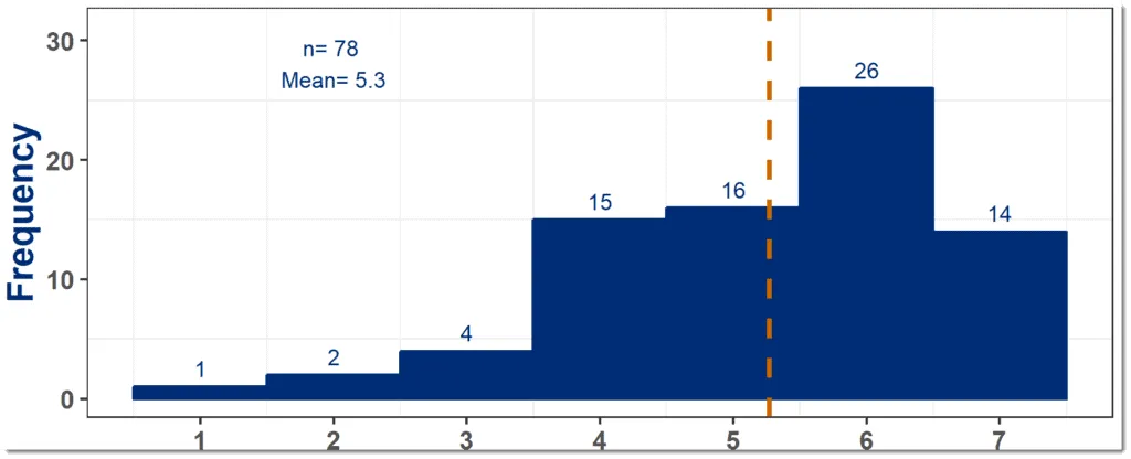
Histograms give more qualitative information about responses than averages alone
They are very useful because, while averages can be easy to calculate, they can also hide a lot information about the responses.
Are the responses nicely spread around the average or skewed to one side or maybe there are there two or more peaks?
While each sample might have the same average, they can have very different looking histograms – and seeing those histograms can help you more effectively interpret the responses.
So, you should create a histogram for each of your questions and then review them for interesting profiles.
You can use this resource to help you interpret your histograms
How to Create a Histogram
Note: You will need the free Excel Data Analysis tool kit before you begin. If you don’t have it, or you’re not sure, check out the Microsoft site
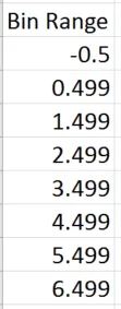
First, you’ll need to create a set of “bin” values.
Typically, your survey response scale will use 0-5 or 0-7 or 1-7 or something similar so your bins need to cover each of the score options.
Here is a bin range for a 0-5 response scale. Note that it starts at -0.5 to catch the 0’s and goes to 5.499 to catch the 5’s.
Also, note the use of “0.499” elements – this is to catch the half scores that some people might use (if your survey allows it.)
Now you have the bins you can create a histogram for each of your survey response. This short video shows you exactly how to do that.
Step 4: Plot Averages Over Time, with Error Bars
If you have historical data you should also plot each question over time. Here again it is important to add error bars so you can accurately interpret the data.
You can use the same approach you used for question histograms.
Here you are looking for statistically significant changes in the score from one time period to another.
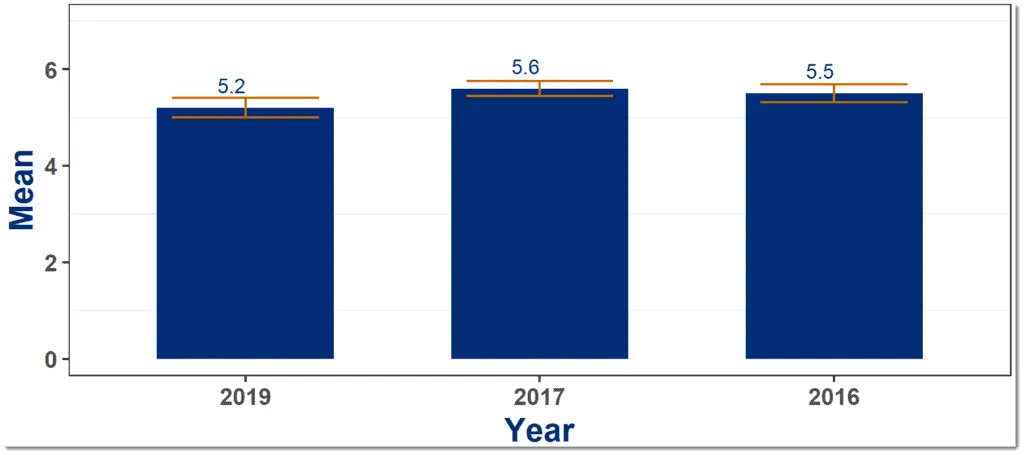
Example of time based question average with error bars
Step 5: Test for Significant Differences with Student’s t-Test
In this step you can use Excel’s built in statistical formulas to determine if there are statistically significance differences either:
- Between time periods ; and/or
- Between questions; and/or
- Between respondent segments
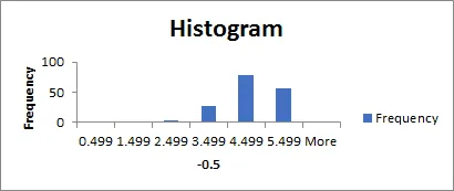
If your histograms show a relatively nice “normal” distribution curve, you can use some more advanced statistics to add value to the data.
See below for the histogram from the example. You can see that it has a nice even shape with just one peak. It looks normally distributed (the “bell curve”) so we can carry on with the more advanced statistics.
Student’s t-Test is a good way to answer two of our questions from the start of the post:
- Are the responses for one question / customer segment significantly different from the responses for another question / customer segment
- Are the responses for one question changing over time
The t-Test allows you to test if the average for one set of scores is probably different from the average for another set of scores.
Hopefully you can see that both these questions, and all their variations, are asking the same basic question:
Does the average for this set of question scores differ significantly from the average for that set of question scores
At all times, you are just comparing two sets of scores, for example:
- Question 1 last month with Question 1 this month
- Question 1 this month with Question 2 this month
- Question 1 for respondents from Segment A with Question 1 for respondents from Segment B
So, you can use the T-test in all these areas. I’ve already written a detailed post exactly how to use the t-Test on survey responses so I’ll refer you there for the details.
Note: there are downsides with just comparing everything with everything. Think about it for a few seconds. If you set your test so you have a 95% confidence level and you test 20 different pairs of responses, on average, one of them will show a positive test just on random chance (5% chance). There are ways to overcome this problem but they are outside the scope of this post.
So, in general take care just comparing everything with everything – do it deliberately.
Step 6: Test for Potential Cause and Effect using Correlation
In this step we will perform correlation analysis to see if two variables might be linked.
Cause and effect is the focus of this section with the focus mostly on outcome variables and attributes.
For instance: does our Net Promoter Score go up, and down as our Responsiveness score goes up and down?
You have probably heard the saying that correlation does not imply causation and it is true that you need to be careful not to over emphasise the impact of a high correlation.
However, it is also true that correlation does not deny causation. It’s a good place to start your investigation.
When investigating correlation, start by looking at how your survey outcome question correlates with your attribute questions. Creating the chart below for each of your attributes is a good place to start.
Attribute questions that correlate highly with the outcome question are good candidates for key business drivers.
Calculating in Correlation in Excel
The easiest way of calculating correlation is to simply graph your two data sets and ask Excel to add in the “Linear Trend Line”. This has the advantage of also letting you see the data so you can determine if the data looks right, i.e. one or two points are not skewing the results.
Again I have a short video to help you on this.
Interpreting the correlation coefficient (R) is the subject of a whole blog post, but in summary:
The correlation coefficient (R) indicates the correlation between the two values.
- R = 1 is a perfect correlation
- R = 0 indicates no correlation at all
- R = -1 is a perfect negative correlation, a move up in one variables correlates to a move down in the other.
So, the closer 1 the better the correlation and you can generally ignore anything less that about 0.3 for this value.
Excel shows you the R-squared value. This number indicate the percentage of variation in that one variable explains variation in the other variable.