Landing Page vs Homepage: Pro Tips for Success
Landing pages and homepages look similar from the outside and serve completely different jobs, one is a single-CTA conversion machine, the other a broad orientation page. Mix them up and both quietly under-perform. Here's the side-by-side, with what makes a good landing page (one CTA, audience-targeted, no navigation, offer in the first block) and where most teams blur the line.

On this page
To the average consumer a landing page and a homepage may seem like the same thing, but the only thing they have in common is that your prospects may visit them. during their B2B marketing journey with you.
Besides that, the structure, use and location of a landing pages is massively different from a homepage. To set up a well-oiled marketing machine a major moving part will be having a homepage and multiple well-placed landing pages.
When building your website there are a three main technology platforms. You can use Wix, WordPress, or Squarespace and each gives you options for both homepages and landing pages.
Key Takeaways: Landing Pages vs. Homepages
- Purpose: Homepages provide a broad overview of a company and its offerings, guiding visitors to explore further. Landing pages, on the other hand, are focused on a single conversion goal and driving specific actions.
- Audience: Homepages cater to a wide audience with varying interests and needs, while landing pages target specific audience segments with tailored messaging and offers.
- Navigation: Homepages feature extensive navigation menus to help visitors explore the website, whereas landing pages minimize navigation to keep visitors focused on the conversion goal.
- Messaging: Homepages use general messaging to appeal to a broad audience, while landing pages employ targeted messaging that aligns with specific campaigns and audience segments.
- Design: Homepages often have a more complex design with multiple sections and elements, while landing pages are streamlined and optimized for conversion, with a strong emphasis on clear calls-to-action (CTAs).
- Traffic Sources: Homepages receive traffic from various sources, including direct visits, organic search, and referrals. Landing pages are typically linked to specific campaigns, such as PPC ads, email marketing, or social media promotions.
What are differences between a landing page and a homepage?
A homepage is located permanently on the front page of your website and can be considered the face of your brand.
A landing page contains information focused on lead capture created and used for a specific campaign or a call-to-action.
These descriptions show you the core principles behind these two page types, and by understanding these descriptions, you will better understand all the other differences that come along with them. To make these differences clear, I’ve created a table of features.
Differences Between Landing Pages and Homepages
| Feature | Landing Page | Home Page |
|---|---|---|
| Location | CRM/Website/Page tool | Website |
| Purpose | Campaign specific Lead capture | Introduction to a company’s brand |
| Duration of publication | Duration of campaign | Permanent |
| Traffic Sources | Paid, Owned and Earned media | Paid, and Owned and Earned digital media |
| Calls-to-Action | Singular | Multiple |
| URL | Prospect activity can be tracked with a UTM code | Typically the Company root domain, e.g. www.company.com |
| Production lifecycle | Very short (1-2 hours) | A few days |
| Navigation | Very limited to deter The Call to Action (form, download, etc) should be the only thing on the page. Remove menus. | At least one home menu and multiple CTA’s including social buttons, other site pages and links to on-site blogs. |
| Marketing funnel focus | All: ToFu, MoFu, BoFu | Should include different parts of the marketing funnel with particular focus on ToFu and BoFu |
What makes a good landing page?
Have only one Call to Action (CTA)
The sole purpose of a Landing Page is to convert visitors to subscribers.
Each Landing Page should have only one offer, for one marketing campaign.
The only task a visitor should be able to do is convert into a subscriber through a single, well-placed and compelling CTA.
Targeted by Audience
One of the key advantages of landing pages is their ability to deliver targeted messaging to specific audience segments and campaigns. Unlike homepages, which cater to a broad audience and provide general information, landing pages allow you to tailor your content and offers to the specific needs and interests of your target audience.
Your landing page should speak directly to the pain points, desires, and goals of your specific target customer, you can create a more personalized and compelling experience.
Consider creating different landing pages by:
- Seniority: for C-suite, middle managers, etc
- Role: Accounting, Marketing, Operations, etc
- Market: Professional services, manufacturing, etc
- And any other element that makes them unique.
This approach helps to capture your visitors’ attention, build trust, and ultimately increase the likelihood of conversions.
Remove Non-Essential buttons and menus
Best practice is to create a landing page with only one focus, that one focus should be the CTA which leads to a goal (usually to obtain contact details).
So, as far as possible, the CTA should be the only way to navigate away from a landing page. Remove menu bars and other links navigating to pages on your website.
Add links to other offers and pages in the thank you page once your prospect has converted.
Make the offer clear in the first block
Prospects typically spend no more than a few seconds reading content before deciding to click away or stay to learn more. So make sure that the offer is concisely described and the value is clear in the first block of the landing page.
The second and third block (if you have them) can be used for expanding on the finer details of your offer or adding reviews and testimonials of people who have already enjoyed your offer.
Make it easy to read and use a large font
Think of the content of a landing page as an advertisement – you are selling the conversion. You need the layout and the font to capture your audience so the text needs to be easy to read. A font above 12 is advisable.
Use white space to make the page clean
keep your text concise and don’t crowd the landing page with too much information or complex imagery. It can be distracting and make it harder for your prospects to focus on your CTA’s.
Don’t underestimate the value of white space. It makes it easier for your prospects to focus on what they should be doing and the right amount keeps your landing pages looking clean and modern.
Use a UTM code to track prospect activity
The great thing about landing pages is that you can create them quite quickly, allowing you to assign each a UTM code (a code at the end of your URL) to track any visitors to that page. By using UTM codes and analysing the data in Google Analytics 4, you can gain valuable insights into your campaign performance and visitor behaviour.
For instance, you may have one offer but different sources for it, such as one source being email and the other being a Facebook ad. By cloning a landing page and assigning a unique UTM code to each, you can see how prospects are reaching your offers and compare the effectiveness of various channels.
That’s important if you want a good return on your investment with a strong Facebook ad CTR, particularly as cloning a landing page can take only minutes.
Optimize Page Speed for Better User Experience and Conversions
One critical aspect of a high-performing landing page is its loading speed.
A fast-loading page not only provides a seamless user experience but also positively impacts conversion rates. Even a slight delay can lead to potential prospects abandoning the page. To ensure your landing page loads swiftly, follow these optimization tips.
Firstly, optimize your images by compressing them without compromising quality. Large, unoptimized images can significantly slow down your landing page. Use tools like TinyPNG or ImageOptim to compress images before uploading them to your page.
Additionally, be mindful of the file formats you use, as formats like WebP or SVG can offer better compression and quality compared to traditional JPEGs or PNGs.
Secondly, minimize the use of JavaScript and CSS files by combining and minifying them. This process reduces the number of HTTP requests and file sizes, resulting in faster page loading times.
Use tools like JSCompress for JavaScript files and CSS Minifier for CSS files to achieve this. Lastly, implement caching techniques to store static files and reduce server load.
This can be done through browser caching or using a Content Delivery Network (CDN) to distribute your static files globally, ensuring fast access for users regardless of their location.
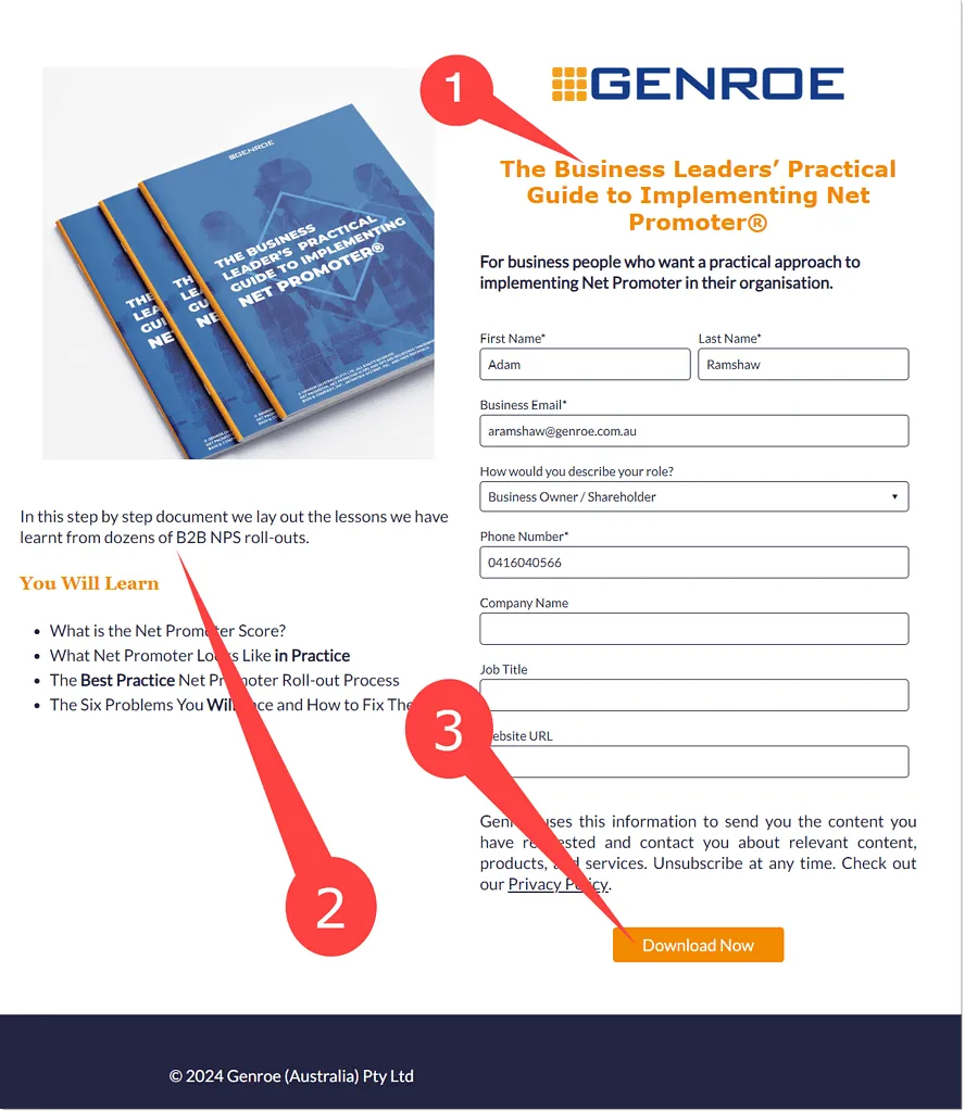
Example of a Great Landing Page
In the example landing page below you can see all of these best practices:
- The offer (1) is very clear and very early on in the page
- There are no navigation elements to tempt the read away. The logo element links back to the main site if the visitor really wants to go back there.
- Additional “selling” detail for the offer is provided in (2)
- There is only one CTA (3) on the page
- The page is clear and uncluttered with lots of whitespace
- Clear targeting of this offer to “business leaders wanting to implement Net Promoter Score”
What makes a good homepage?
Easy navigation for all stages of the marketing funnel
Consider why a prospect may want to visit your homepage.
It’s likely because they have heard about your brand and what you have to offer and are looking to find out more about your company.
So make it clear from the in the first block of the website, what your company does, and then mention your most popular offers throughout the homepage. This assures your visitor that whatever they are looking for is indeed on your website and they are more likely to stay on your website to find out more.
Top of the funnel CTA in the first block
Prospects that visit your homepage/website for the first time are typically at the top of your marketing funnel. So placing a CTA in the most important block for a bottom of the funnel offer isn’t going to get many click throughs.
So pick a smaller Top of the Funnel package that you can offer for prospects who would like to give your services a test run.
Clear branding
Prospects visiting your website homepage is a clear sign that they know about you, so it’s important that you maintain that and start to grow that relationship. One important thing to do is to familiarise your prospect with your branding so that when they come across you again later (Read more about this in our buyer’s journey blog) they will recognise you and pay more attention.